Description
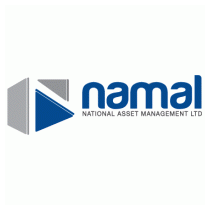
The element is a 3D representation of the ‘N’ from Namal, using negative space. The perspective and depth in the icon suggests stability and solidity, while the use of negative space gives the whole icon a sense of spatial fluidity – Namal is strong, yet flexible enough to mold itself to any market scenario. The ‘arrow shaped’ elements in the icon, also lends a degree of dynamism to the logo and derivatively to the company.
